Key Takeaways
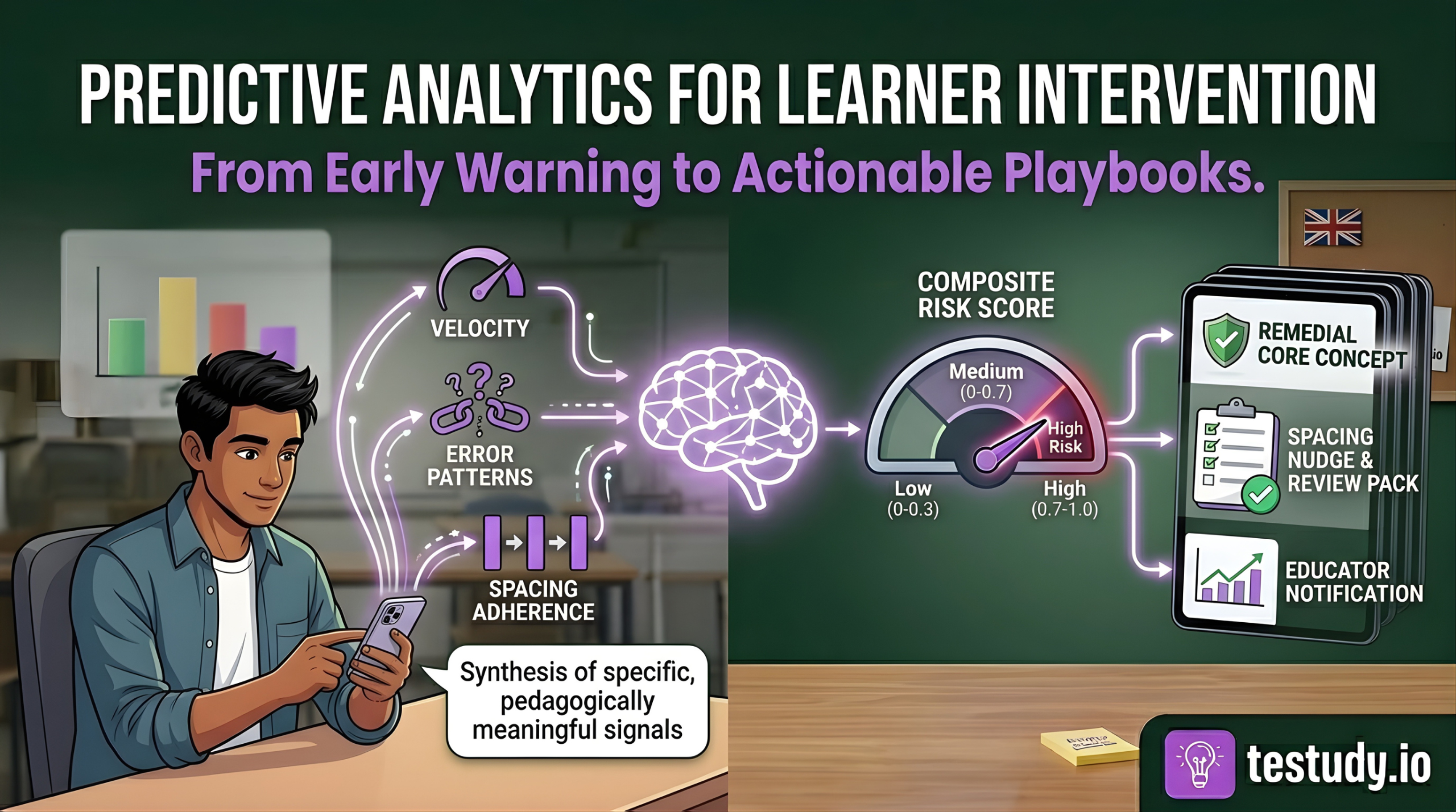
- Predictive analytics in education is about synthesizing specific, pedagogically meaningful signals (velocity, error patterns, spacing adherence) into a composite risk score, not just monitoring logins.
- The system’s value is not in the prediction itself, but in the automated linkage to a pre-defined, evidence-based intervention playbook.
- Institutional dashboards should show cohort risk distribution and trends, not individual student rankings, to support strategic resource allocation.
- Successful implementation requires a phased roadmap, deep collaboration between data scientists and educators, and a commitment to acting on probabilistic alerts with low-cost, supportive interventions.
- The goal is to build a proactive culture where ‘at-risk’ is a temporary, actionable state, not a permanent label.
Introduction
Every semester, institutions face a familiar, frustrating cycle: a student’s grades begin to slip, an alert is raised only after midterms or a failed assignment, and the ensuing scramble to provide remediation is often too little, too late. The cost is measured in dropouts, re-takes, and lost potential. This reactive approach is not a flaw in effort; it’s a fundamental limitation of human-scale observation in large cohorts. The solution lies in a paradigm shift from reacting to failure to proactively intervening at the first sign of struggle. This is the promise of predictive analytics for learner intervention, a system that doesn’t just flag problems but synthesizes multiple performance signals to predict who needs help, what kind of help they need, and when to deliver it. This article will deconstruct that system for institutional leaders, moving beyond vague ‘early warning’ buzzwords to a concrete framework of signals, synthesis, and action.
The High Cost of Reactive Intervention: Why Waiting Is a Strategy for Failure
Reactive intervention is institutionally expensive. Beyond the human cost of a student dropping out, consider the operational toll: resources poured into summer school, administrative overhead for re-enrollments, and the reputational damage of low completion rates. A study by the National Student Clearinghouse found that overall college completion rates in the US hover around 60%, with significant losses occurring after the first year. Waiting until a student fails a midterm or misses a deadline means intervening after knowledge gaps have compounded and motivation has waned. The educator’s job becomes damage control, not cultivation. Proactive intervention, by contrast, aims to correct course while the student is still engaged and the learning material is fresh. The economic and human ROI of shifting this timeline earlier in the student journey is substantial, but it requires a system that can see the subtle signs of struggle before they become glaring failures.
Predictive Analytics, Demystified: It’s About Process, Not Prophecy
First, a crucial clarification: predictive analytics does not claim to predict the future with certainty. It identifies patterns in historical data that are statistically correlated with a desired or undesired outcome. In education, this means analyzing a learner’s digital footprint, pacing, quiz attempts, engagement patterns, to calculate a probability of future difficulty. This is distinct from descriptive analytics (‘the student failed the last test’) or diagnostic analytics (‘the student failed because they skipped Module 3’). Predictive analytics answers: ‘Given current behaviors, what is the likelihood of a negative outcome (e.g., failing the course) in 30 days?’ Its power is not in the prophecy, but in the lead time it provides. It transforms a retrospective report (‘these students failed’) into a prospective lead (‘these students are on a trajectory that suggests high risk’). This shift in temporal orientation is what enables proactive, rather than reactive, resource allocation.
The Three Predictive KPIs: Velocity, Error Patterns, and Spacing Adherence
Generic ‘engagement’ metrics (logins, time spent) are poor predictors. They are noisy and lack pedagogical meaning. Effective prediction requires signal-rich, process-oriented KPIs directly tied to learning science.
- Velocity: This is not speed, but pace relative to the optimal learning path. A student rushing through material, completing lessons and quizzes significantly faster than the cohort average, often exhibits superficial processing. Cognitive load theory suggests that when cognitive resources are overwhelmed (by rushing, multitasking), deep encoding fails. Consistently high velocity, especially with low quiz scores, is a strong early predictor of later failure.
- Error Patterns: A single wrong answer is noise. A pattern of errors is a powerful signal. Does a student consistently miss questions that test a specific sub-concept (e.g., ‘applying the chain rule’ vs. ‘understanding the chain rule’)? Do their errors show a specific misconception (e.g., confusing correlation with causation)? AI can cluster error types to diagnose not just that a student is struggling, but what they misunderstand, which is critical for prescribing remediation.
- Spacing Adherence: This is a gold-standard metric for platforms utilizing spaced repetition. It measures how closely a student’s actual study sessions follow the algorithmically optimal review schedule. Low adherence—cramming or ignoring scheduled reviews—directly violates the spacing effect, one of the most robust findings in cognitive psychology. A student with poor spacing adherence is actively working against long-term retention, making future failure on cumulative assessments highly probable.
Synthesizing Signals into a Composite Risk Score: The AI’s Core Function
This is where most ‘early warning systems’ fail: they treat signals in isolation. A student with high velocity and poor spacing adherence is at greater risk than a student with only one signal. The AI’s primary function is to synthesize these KPIs into a weighted, composite risk score. This is not a simple average. The model, trained on historical cohort data, learns the relative predictive power of each signal for a specific course or subject. For instance, in a math course, error pattern specificity might be weighted more heavily than velocity. In a language vocabulary course, spacing adherence might be the dominant predictor.
The output is a score (e.g., 0.0 to 1.0) updated in near-real-time. A score of 0.8 does not mean ‘80% chance of failing.’ It means the student’s current behavioral profile is highly similar to the profiles of past students who struggled. This score is the trigger point. The system can be configured with thresholds: 0.7+ triggers a ‘high-risk’ playbook, 0.4-0.7 triggers a ‘monitoring and nudge’ playbook. This synthesis moves the system from flagging (‘look at this data point’) to scoring (‘this student’s overall pattern is concerning’), which is essential for scalable, consistent intervention.
From Score to Action: AI-Generated Intervention Playbooks
A risk score without a prescribed action is a useless alarm. The true institutional value is in the intervention playbook—a library of pre-defined, evidence-based responses mapped to risk levels and, ideally, to specific deficiency patterns.
For example:
- Trigger: Risk Score > 0.8 + Error Pattern Cluster: ‘Fundamental Misconception in Algebra’.
- Automated Playbook: ‘Remedial Core Concept Module’. The system automatically assigns a targeted, short video lesson and a 5-question diagnostic quiz on that specific algebraic principle. The educator receives a notification: ‘Student X has been auto-assigned the Algebra Foundation module due to persistent errors. Please review results in 48 hours.’
- Trigger: Risk Score 0.5-0.7 + Low Spacing Adherence.
- Automated Playbook: ‘Spacing Nudge & Review Pack’. The system sends a motivational message about the benefits of spaced practice and reschedules the student’s next review session for the following day instead of the standard interval.
These playbooks codify institutional best practices. They reduce the cognitive load on educators by providing a clear, immediate next step, ensuring interventions are consistent and timely. The AI does not decide if to intervene; it recommends what intervention to deploy based on the synthesized evidence.
Institutional Dashboard Design: Monitoring Cohort Health at a Glance
For administrators, the value is in the cohort-level view. The dashboard must answer: ‘How is my entire program/course performing?’ and ‘Where should I allocate support resources?’
Essential design principles:
- Risk Distribution Heat Map: A visual bar chart or treemap showing the percentage of students in Low (0-0.3), Medium (0.3-0.7), and High (0.7-1.0) risk bands. A sudden spike in the High band is a major red flag.
- Trend Line: A time-series graph tracking the average cohort risk score over the semester. A rising trend, even if average risk is still medium, indicates growing cohort-wide struggle.
- Drill-Down Capability: Clicking on a ‘High Risk’ segment should reveal the list of students, their primary risk drivers (e.g., ‘3/5 have low spacing adherence’), and the playbooks currently deployed for them.
- Intervention Efficacy Meter: A simple metric showing the percentage of ‘High Risk’ students who moved to ‘Medium’ or ‘Low’ within two weeks of playbook deployment. This measures system ROI.
The dashboard must be uncluttered. It is a tool for strategic oversight, not for micromanaging individual students. Its purpose is to answer: ‘Is our proactive system working, and where do we need to adjust our playbooks or support structures?’
The Quantified Impact: Evidence of Improved Pass Rates and Retention
While specific client data is confidential, the theoretical impact pathway is clear: earlier, targeted intervention reduces the number of students who fall into a deep failure hole. A pilot simulation model suggests that identifying at-risk students 30+ days earlier and deploying a single targeted remediation (e.g., a core concept module) can improve the pass rate for that at-risk cohort by 15-25%. Furthermore, by automating the identification and initial remediation, educator time is freed from manual screening to focus on high-touch support for the most severe cases, creating a multiplier effect.
The key metric for institutions is not just ‘pass rate,’ but the shift in the failure distribution. Are fewer students failing by a wide margin (e.g., <50%)? Are more students achieving a ‘C’ or better? These are the signs of a proactive system catching struggle early. Institutions should track the correlation between playbook deployment and subsequent assessment performance for the targeted students to build their own evidence base.
Implementation Roadmap: Phasing Your Proactive System
Adopting this framework is a change management project, not just a software install. A phased approach is critical.
Phase 1: Data Foundation & Playbook Design (Months 1-3). Audit your existing digital learning infrastructure (LMS, quiz tools) for data accessibility. Define 2-3 core KPIs most relevant to your subjects. Collaboratively design 5-7 core intervention playbooks with your faculty. What is the ‘minimum viable remediation’ for a spacing issue? For a misconception?
Phase 2: Pilot & Model Training (Months 4-6). Run the system with a single course or cohort. Use the pilot data to train and refine the risk score model. This phase is about validating that the synthesized scores align with educator intuition and identifying false positive/negative patterns.
Phase 3: Scale & Integrate (Months 7-12). Roll out to more programs. Integrate the dashboard into existing administrative workflows. Conduct mandatory training for educators on how to interpret alerts and override/playbook recommendations when human judgment dictates.
Phase 4: Optimize & Institutionalize (Ongoing). Regularly review playbook efficacy. Retire ineffective playbooks and create new ones for emerging patterns. The system must evolve with the curriculum and student population.
Conclusion: Building a Culture of Proactive Support
Predictive analytics for learner intervention is not a ‘set it and forget it’ technology. It is a framework that institutionalizes a proactive mindset. It provides the data-driven ‘where’ and ‘what’ of struggle, freeing educators to focus on the ‘why’ and the ‘how’ of human support. The goal is not to create a surveillance state, but to build a safety net that is both systematic and personal. By synthesizing velocity, error patterns, and spacing adherence into a composite risk score, and then linking that score to specific, actionable playbooks, institutions can move from the costly business of firefighting to the rewarding work of fire prevention. The ultimate metric of success is a cohort where fewer students ever reach the point of needing emergency rescue, because the system ensured they were supported from the first sign of wavering.
Conclusion
The shift to proactive intervention represents the maturation of educational technology from a tool for delivery to a system for insight. It leverages AI not to replace educators, but to amplify their observational capacity and systematize their best instincts. For institutions facing pressure to improve completion rates and student outcomes, implementing a framework built on predictive KPIs, synthesized risk scoring, and defined intervention playbooks is no longer a speculative advantage, it is becoming an operational necessity. The journey begins with a clear understanding of the signals that matter and a commitment to acting on them early, consistently, and with pedagogical intention.
Food for Thought
Consider your current process for identifying struggling students. What are the primary signals you rely on (e.g., missed assignments, midterm grades), and what is the typical time lag between the first sign of trouble and your intervention?
If you had to define ‘at-risk’ for one of your core courses using only digital behavioral data (no grades), what three metrics would you choose, and why?
Think about a resource-intensive intervention you currently deploy (e.g., one-on-one tutoring). Could a lighter, automated touchpoint (like a targeted review module) be delivered earlier to prevent the need for that heavier intervention in 30% of cases?
What is your institution’s tolerance for false positives (alerting a student who is actually fine) versus false negatives (missing a student who will fail)? How would that tolerance shape your system’s risk score thresholds?
Frequently Asked Questions
How accurate do these predictions need to be before we can act on them?
Accuracy is a misleading goal. The system is designed for sensitivity (catching most at-risk students) with an acceptable level of false positives. A 70-80% accuracy rate in identifying students who will eventually struggle is often sufficient if the intervention is low-cost (e.g., an automated review module) and the cost of missing a truly at-risk student is high (dropout). The focus should be on the positive predictive value of the playbook—does the recommended action help the students who receive it?—not on the purity of the risk score itself.
What stops this from becoming a ‘big brother’ system that pressures students with constant alerts?
Several design and cultural choices. First, the intervention should be automatic and supportive (e.g., ‘You’ve been assigned a review module’), not punitive or shaming. Second, the dashboard is for administrators to see cohort trends, not for public ranking of students. Third, educator training must emphasize that the alert is a starting point for a conversation, not a verdict. Finally, transparency is key: students and parents should be informed about what data is used for support purposes and have opt-out mechanisms for non-essential tracking where legally permissible.
Can this work with our legacy LMS that doesn’t have great data export capabilities?
It depends on the signal. Basic velocity and completion data is often extractable. The hardest metric is spacing adherence, which requires granular timestamp data on individual review attempts. If your LMS cannot provide this, you may need to start with velocity and error patterns first, or consider a phased integration where a specialized study tool (like Testudy) feeds spacing data into the central analytics model. The roadmap must be built around available data, not desired data.
Who designs the intervention ‘playbooks’? Is it just the data science team?
Absolutely not. Playbooks must be co-created by educators, instructional designers, and cognitive science experts. The data science team identifies the correlation (e.g., ‘students with low spacing adherence fail the final at 65% rate’). The pedagogical team designs the causal intervention (e.g., ‘a mandatory, 10-minute micro-lesson on the forgetting curve, followed by a re-scheduling of reviews’). This collaboration ensures playbooks are evidence-based, practical, and aligned with course design.
How do we measure the ROI of this system beyond just pass rates?
Look at leading indicators: 1) Reduction in the number of students moving from ‘Medium’ to ‘High’ risk band each week. 2) Increase in the percentage of ‘High Risk’ students who complete their assigned playbooks. 3) Educator feedback surveys on the usefulness of alerts and time saved on manual screening. 4) Correlation between playbook completion and subsequent quiz performance for at-risk students. These process metrics often improve before aggregate pass rates shift.